 Why Wordnerds is the value multiplier for your Medallia investment
What Medallia does brilliantly, what it doesn't, and how CX teams are pairing it with a specialist Voice of Customer layer.
Why Wordnerds is the value multiplier for your Medallia investment
What Medallia does brilliantly, what it doesn't, and how CX teams are pairing it with a specialist Voice of Customer layer.
Tools & How-To
3-Step Framework for Actionable Qualitative Insights in Power BI
Most customer-feedback dashboards describe problems but never drive a decision. Here's the three-step framework we use to turn messy qualitative feedback into Power BI dashboards people actually act on: classification, a semantic model, and visualisation built for action.

Created · Last updated
What makes a customer insight actually actionable?
Qualitative feedback—survey verbatims, complaints, reviews, contact-centre notes—is the richest source you have for understanding what customers actually need. But richness isn't the same as action. An insight is only actionable when it gives a team the fuel and the evidence to change something. From our work with housing associations and other regulated sectors, every genuinely actionable insight has three components:
- An obvious next step—it's clear what to do
- A measurable result—you'll know whether it worked
- A human connection—it's grounded in what real customers said
Miss any one of those and the insight isn't ready for the boardroom or the frontline. Compare these two statements:
The second lands in the boardroom because it carries all three components. The first is just a description. And here's the trap most insight teams fall into: a top-line summary that simply confirms what managers already suspect feels like insight, but it doesn't give anyone enough resolution to act. The themes are right—they're just not specific enough to do anything with. The framework below is how we close that gap, using Power BI as the delivery layer. It comes down to three moves:
- Classification—structuring your qualitative data
- Building a semantic model—the logic that makes it usable
- Visualisation—dashboards designed for action, not admiration
Step 1: Classification — structuring your qualitative data
Before you get anywhere near a dashboard, you have to wrangle the raw feedback—and that starts with classification: grouping comments into meaningful, structured themes. It's where we see the biggest difference between organisations that are insight-led and those that are just reporting numbers.
Most teams start with manual tagging or an inherited taxonomy built around internal departments, process stages, or complaint categories. The problem is that those structures reflect how your organisation works—not how your customers think. Feedback gets forced into boxes that make sense to you and obscure what customers are actually telling you.
What good classification looks like
- Thematic clarity—each theme represents one idea; no catch-alls, no overlaps.
- Relevance to action—every theme is something a team can actually do something about.
- Consistency across sources—the same model works across surveys, complaints, reviews and social, so you're comparing like with like.
Getting this right is partly discipline and partly tooling. It's the job Wordnerds was built for: classifying feedback into themes that emerge from what customers say, rather than from a taxonomy you have to maintain by hand. Once your classification is clear, structured and action-relevant, you can build the logic that powers your reporting—the semantic model.
Step 2: The semantic model — the logic layer Power BI needs
Power BI can't do much with a thousand angry comments about repairs. Classification gives those comments structure—themes, sentiment, topics. The semantic model is what makes that structure usable: it turns classifications into the metrics, aggregations and relationships your dashboards can actually work with.
It's the logic layer that sits between your data and your visuals, and it handles things like:
- Aggregating sentiment by theme
- Connecting survey scores to the topics behind them
- Weighting different feedback sources appropriately
Get the semantic model right and you've built the engine. But an engine isn't a destination—and too many teams treat the dashboard as the end product when it's really the bridge between analysis and action. Build that bridge badly and all the classification and modelling in the world stays locked up where no one can use it.
Step 3: Visualisation — designing dashboards for action
Even a perfect semantic model fails if the dashboard confuses people. We see a lot of dashboards that are beautiful and unusable, because they're built for analysts rather than for the people who have to act. Dashboards that drive action are:
- Role-specific—a repairs manager needs a different view from a CX lead.
- Frictionless—under 30 seconds from opening a view to knowing the next step.
- Context-rich—a chart without the customer quotes behind it won't create the empathy or the confidence to act.
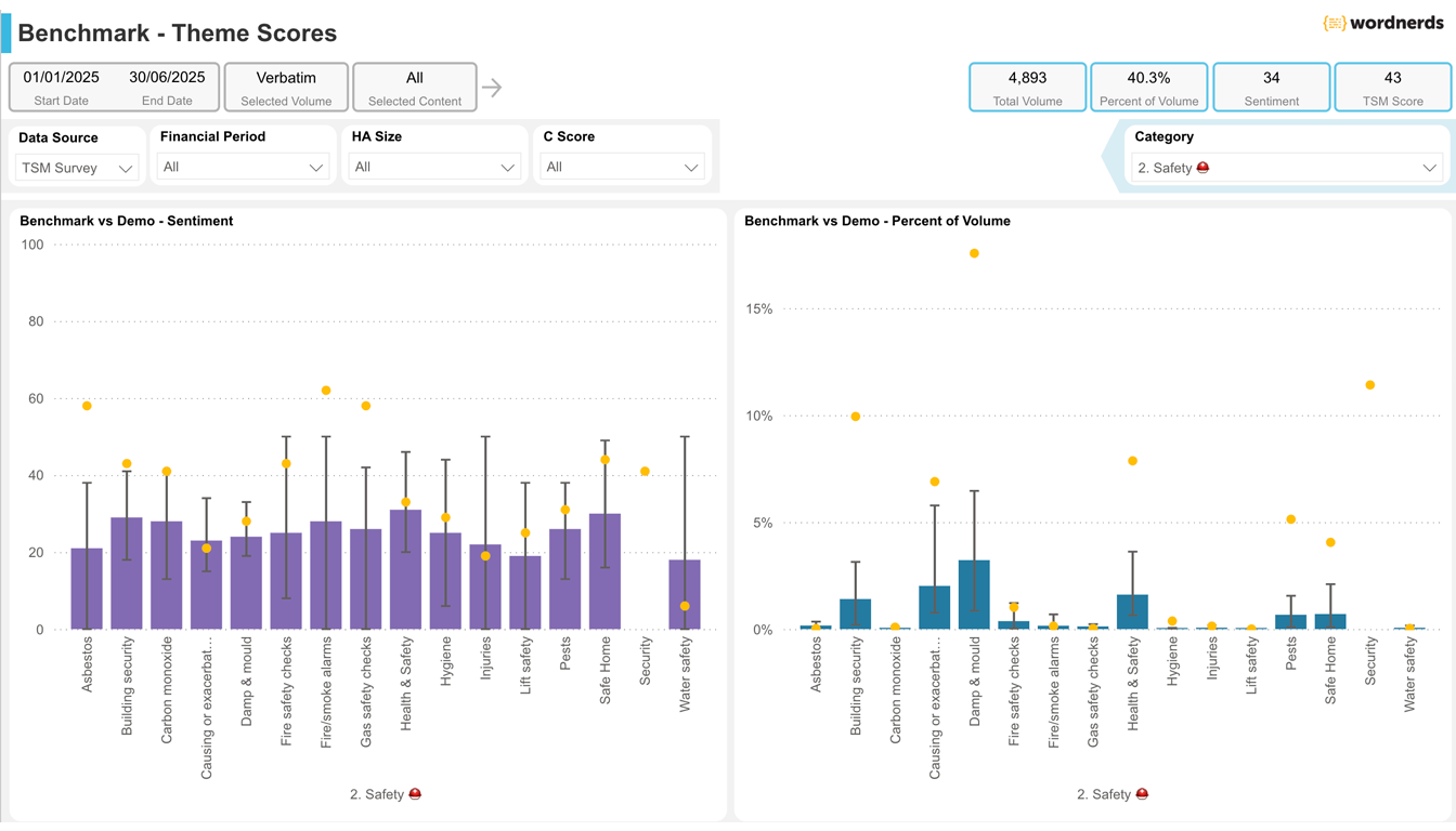
This isn't theoretical. For one housing association, we built a view where a manager clicks "damp and mould" and instantly sees the score, the sentiment, and the actual resident quotes in one place. For a transport client, we set up alerts for when delay complaints spike on specific routes—so operations can act now, not three months later when the quarterly report lands.
Share insight beyond the analyst's desk
Good insight that only the insight team sees doesn't change anything. The point of putting feedback into Power BI is that everyone in the organisation can act on what customers are saying—not just the analysts. A few ways to make that real:
- Role-specific dashboards for each team—contact centre, repairs, exec.
- Short Power BI sessions for non-analysts, so people can filter and interpret with confidence.
- A monthly one-page digest for the teams who'll never open the dashboard.
- Visibly close the loop—when feedback drives a change, show it, so people keep feeding the system.
Closing the loop: making it stick
Power BI is a powerful delivery layer, but it isn't magic. If your classification is messy, your semantic model isn't set up properly, or your dashboards are built for the wrong audience, the insight won't land—however good the underlying analysis is.
Get the three steps right—Classification → Semantic Model → Visualisation—and you move from reports that describe problems to dashboards that drive action. Add a named owner for each insight and a before-and-after measure, and you've closed the loop: feedback stops being a reporting exercise and starts being a strategic asset.
Frequently asked questions
What makes a customer insight actionable?
An actionable insight has three parts: an obvious next step, a measurable result, and a human connection to what real customers said. A finding that names a theme but not what to do about it—or that can't be measured—describes a problem rather than driving a decision.
How do you get qualitative customer feedback into Power BI?
In three steps: classify the free-text feedback into structured themes and sentiment; build a semantic model that turns those classifications into metrics and relationships; then visualise them in role-specific dashboards. Wordnerds builds the structured data layer so the feedback arrives in Power BI ready to use.
What is a semantic model in Power BI?
The semantic model is the logic layer between your raw data and your visuals. For feedback analysis it turns classified themes and sentiment into the metrics, aggregations and relationships dashboards rely on—aggregating sentiment by theme, linking survey scores to topics, and weighting different feedback sources.
Why don't my customer-feedback dashboards drive action?
Usually because they're built for analysts, not decision-makers: too low-resolution to target a fix, with no obvious next step and no customer quotes behind the numbers. Role-specific, frictionless and context-rich views—under 30 seconds from opening to knowing what to do—are what change that.
Can I ask questions of my feedback in natural language?
Yes. Once feedback is classified and modelled as a structured data layer, decision-makers can query it conversationally—Power BI's Copilot (with the relevant licence) lets people ask questions of the dashboard in plain English and get accurate, auditable answers without waiting for an analyst.
Read more from the blog
Why Wordnerds is the value multiplier for your Medallia investment
What Medallia does brilliantly, what it doesn't, and how CX teams are pairing it with a specialist Voice of Customer layer.
 What 135,000 tenant voices revealed: the Wordnerds × Housemark Social Housing Benchmarking Report 2026
The UK's first qualitative TSM benchmark — 135,000+ tenant comments across 18 housing associations, and four findings the satisfaction scores weren't telling you.
What 135,000 tenant voices revealed: the Wordnerds × Housemark Social Housing Benchmarking Report 2026
The UK's first qualitative TSM benchmark — 135,000+ tenant comments across 18 housing associations, and four findings the satisfaction scores weren't telling you.
 You're not ignoring tenant safety. You're just finding out too late.
Under Awaab's Law, a tenant survey comment is a compliance trigger. Here's what an early warning system actually needs.
You're not ignoring tenant safety. You're just finding out too late.
Under Awaab's Law, a tenant survey comment is a compliance trigger. Here's what an early warning system actually needs.
